Abstract: This paper investigates the level of metadata accuracy required for image filters to be valuable to users. Access to large digital image and video collections is hampered by ambiguous and incomplete metadata attributed to imagery. Though improvements are constantly made in the automatic derivation of semantic feature concepts such as indoor, outdoor, face, and cityscape, it is unclear how good these improvements should be and under what circumstances they are effective. This paper explores the relationship between metadata accuracy and effectiveness of retrieval using an amateur photo collection, documentary video, and news video. The accuracy of the feature classification is varied from performance typical of automated classifications today to ideal performance taken from manually generated truth data. Results establish an accuracy threshold at which semantic features can be useful, and empirically quantify the collection size when filtering first shows its effectiveness. [Download DOC]
Project Description
I wanted to find out exactly how good these 'image features' (indoor,
outdoor, cityscape, text overlay, faces, people) need to be before users
will employ them and when users will find them most useful (i.e., how
large do the image sets need to be before users want to use the 'image
features').
My Role & Responsibilities
My advisor and I designed this experiment from scratch together. I designed
and implemented the filter interface. I had to deal with memory issues
and optimized quite a bit for the quick loading and browsing of 1000 352x240
images on a screen.
Some of the interface designs I worked on:

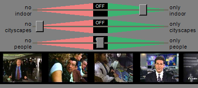
You can see a storyboard of a set of video documents above. I wanted to
give users a method of browsing many images but with the ability to immediately
see detail as they see fit. When the user holds down the "shift"
button and mouses over an image, the image is shown in full-size overlayed
on other images in the storyboard. When the user exits that thumbnail,
the zoomed-in thumbnail disappears.
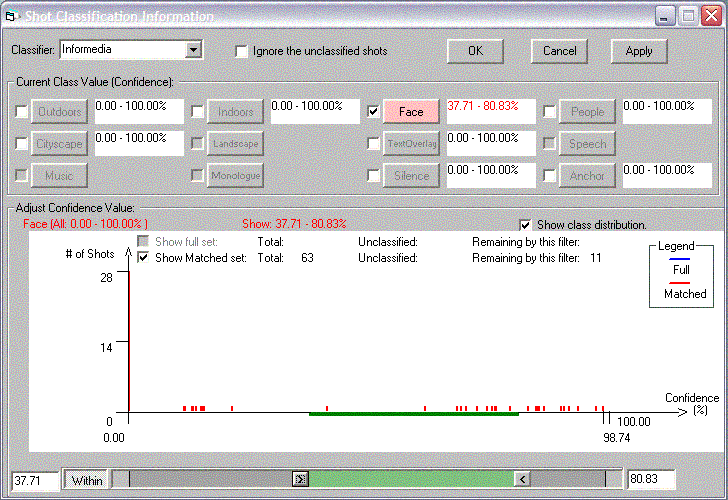
Previous interface (before my redesign)

We ran a study and wondered why nobody was using the filter. Now it seems pretty clear: it's too difficult to use! It's obviously an expert interface. I decided to create a filter interface for real people and leave the expert interface to the experts.
Redesigned interface

I integrated the filter into the storyboard to strengthen the connection
between the two. I gave the users instant feedback (as they move the slider,
the thumbnails appear and disappear) and allowed them to express their
mental model of a typical query (e.g. "I want to see only faces").
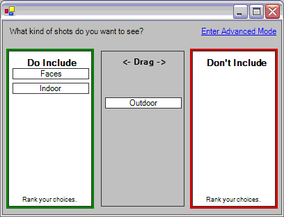
I tried to create an interface that lets them express priority ("Faces are most important to me"). When specifying multiple filters, the vast majority of instances will show that people instantly prioritize their feature requests. So, they might say "ok I want to see faces and they should be outdoor" - in that sentence there is a priority: it's most important to see faces, 2nd most important to see outdoor shots. So I created this:

I conducted some short user studies using this new interface and found
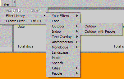
that users didn't understand the model. Either way, I wanted to give users
a way of loading previous filter settings:

Deliverables
We conducted a large student using the interfaces as they apply to sets
of news video, documentary video, and a typical digital photograph collection.
The results are in the following paper: Evaluating Content-Based Filters for Image and Video Retrieval .


